Yellow is making a big comeback in the design world. You see it everywhere from Pantone trends to lively stores on Main Street. It adds energy and clarity to designs. This article will dive into all the shades of yellow. It will provide tips for designers, decorators, marketers, and creators on how to use them.
We’re talking about all kinds of yellow, from pale lemon to rich amber and gold. You’ll learn about yellow’s impact in design, including its psychology, color theory, and how to match it. We’ll cover everything from digital to print color codes and give examples in branding, interiors, fashion, and painting.
Ads
This guide is for designers, brand experts, interior decorators, illustrators, web and UI designers, fashion folks, and DIY homeowners in the USA. It’s full of actionable advice. You’ll learn how to pick the perfect yellow, find color codes for digital and print, do accessibility checks, and how to test colors.
You’ll find practical tips, color codes, case studies from famous brands, and handy checklists in each section. Use this guide to inspire your color choices. Make decisions that are bold yet practical.
Key Takeaways
- Shades of Yellow span from lemon to amber and influence mood and brand voice.
- Yellow in design works across branding, interiors, web, and print when chosen carefully.
- Reference digital and print color codes early to avoid surprises in production.
- Test vibrant yellow samples under different lighting and check accessibility.
- Pair yellow thoughtfully with neutrals or contrasting hues for balance and impact.
The Emotional Power of Yellow in Design
Yellow can feel like a warm sunrise or a sharp caution sign. It’s used by designers to shape how we see things and to grab our attention. Knowing about yellow’s psychology and its emotional impact helps teams pick the right shades for their projects.
Psychological associations with yellow
Yellow reminds people of sunlight, ripeness, and warmth across different cultures. It makes us think of optimism, clarity, and being alert. But, too much bright yellow might suggest caution or impatience if not used carefully.
How color influences mood and perception
Yellow changes how bright or big we think a space is. For example, pale yellow makes rooms feel bigger and more open. Bright yellow can wake us up and even make us hungry, while softer yellows are calming.
Different people and cultures might see yellow in unique ways. Too much bright yellow could strain the eyes or make someone anxious.
Using yellow strategically for branding and interiors
Yellow grabs attention quickly, making it great for things like CTAs, signs, and short-term ads. In spaces like bedrooms or quiet areas, softer yellows help create a peaceful feel.
For a cozy vibe, use mid-tone yellows like mustard or gold. These are perfect for brands that want to feel warm and handmade or for welcoming spaces. Always test your yellow choices with users, especially for projects with a lot of exposure. And make sure your text is easy to read by checking the contrast.
| Application | Recommended Yellow Tone | Psychological Effect | Practical Tip |
|---|---|---|---|
| Call to Action (digital) | Bright lemon yellow | High attention, immediate click impulse | Pair with dark text, test contrast on multiple devices |
| Retail signage | High-saturation yellow | Visibility from distance, urgency | Limit surrounding bright colors to avoid visual fatigue |
| Living rooms and nurseries | Muted pastel yellow | Comforting, light-enhancing | Combine with warm neutrals and natural light |
| Brand identity for artisanal goods | Mustard or warm gold | Heritage, sophistication, tactile warmth | Use textured materials and restrained palettes |
| High-exposure public spaces | Balanced mid-tone yellow | Friendly yet controlled | Conduct accessibility and mood tests with diverse users |
Shades of Yellow
Yellow comes in many different styles, from bright and lively to rich and earthy. Designers choose certain shades to create a mood, show value, or grab attention. This guide will tell you about common yellow shades, how hue, saturation, and brightness change what we see, and offer digital and print references.
Overview of common named shades
Lemon yellow is bright and modern. It’s great for lively packaging, kitchens, or spots that need a burst of energy. Sunflower yellow is deeper and perfect for bold, optimistic marketing.
Mustard yellow has a retro feel and muted warmth, fitting for furniture, autumn colors, and classy branding. Gold implies luxury and is excellent for accents in print and online that show high quality.
Amber is close to orange and adds richness to lighting and signs. Ochre and other earthy tones offer a historic vibe to handmade products. Chartreuse mixes yellow and green for a fresh, natural feel.
How hue, saturation, and brightness change a yellow
Changing the hue towards green or orange changes its effect. Moving towards green makes it look like chartreuse or lime. Shifting towards orange gives us amber and warm gold.
Saturation determines how intense it looks. A high saturation makes yellow stand out on screens and posters. A lower saturation makes colors like mustard look soft and vintage.
Brightness plays a role in how easy it is to read and the light it seems to give off. Brighter yellows like lemon feel light and airy. Darker shades are better for text or backgrounds against white letters.
Digital color codes and print equivalents for popular shades
| Shade | Example Hex | Approx. RGB | Print / Pantone | Use-case |
|---|---|---|---|---|
| Lemon yellow | #FFF44F | 255, 244, 79 | Pantone 102 C, CMYK 0,4,78,0 | Fresh packaging, modern UI accents |
| Sunflower | #FFC512 | 255, 197, 18 | Pantone 123 C, CMYK 0,23,92,0 | Bold marketing, signage |
| Mustard color | #D2A106 | 210, 161, 6 | Pantone 7550 C, CMYK 0,23,100,18 | Upholstery, retro branding |
| Gold | #D4AF37 | 212, 175, 55 | Pantone 7408 C, CMYK 0,18,74,17 | Premium accents, print foils |
| Amber | #FFBF00 | 255, 191, 0 | Pantone 1375 C, CMYK 0,25,100,0 | Lighting, warning signals |
| Ochre | #CC7722 | 204, 119, 34 | Pantone 7555 C, CMYK 0,42,83,20 | Historical design, artisan goods |
| Chartreuse | #DFFF00 | 223, 255, 0 | Pantone 389 C, CMYK 13,0,100,0 | Botanical themes, activewear |
For web projects, compare yellow hex codes with sRGB proofs on real devices. In print, use a physical Pantone guide, like Pantone yellow swatches, for the best match. Proofing in CMYK shows how paper and ink change colors. This helps pick the right shade for your project’s mood and use.
Color Theory: Where Yellow Sits on the Wheel
Yellow has a special spot on the color wheel, important in many design projects. In traditional painting, it’s one of the primary colors. But in digital designs and printing, yellow plays different roles. This knowledge is key for designers to make choices that look good in any format.
Mixing yellow with red or blue can create orange, greens, and more. This process results in the many colors used in logos and indoor designs. Knowing these tricks can dramatically change how a design feels.
Primary, secondary, tertiary relationships
Primary colors are the main ingredients for all the colors we can make. Yellow combines with other primary colors to create new ones. And mixing a primary with a secondary color gives us even more options like yellow-green.
Warm vs cool yellow tones and their effects
Yellows can be warm or cool, depending on their undertones. Warm yellows feel cozy, while cool yellows seem fresh. This knowledge helps in designing spaces to make them feel just right.
Complementary yellow relationships and harmonies
Purple is yellow’s opposite, offering a striking contrast. Yellow also works well with close shades for a gentle look. And when balanced right, it pairs beautifully with two distinct colors for a pleasing effect without overwhelming.
Here’s a quick guide to help pick the best yellow for your design needs.
| Use Case | Typical Mix | Perceptual Effect | Design Tip |
|---|---|---|---|
| Bright signage | Pure yellow or yellow with slight red | High visibility, warm and attention-grabbing | Pair with deep purple for strong contrast |
| Fresh brand accents | Yellow with green undertone | Clean, modern, recedes slightly | Use with cool grays and blues for a crisp palette |
| Interior warmth | Yellow-orange or ochre | Cozy, inviting, brings surfaces visually forward | Balance with neutral whites and wood tones |
| Subtle vintage tones | Muted yellow mixed with brown or gray | Soft, aged, understated | Complement with mustard accents and deep greens |
| High-contrast palettes | Pure yellow plus violet or indigo | Dynamic, energetic, visually striking | Limit violet area to avoid overpowering yellow |
Pairing Yellow with Complementary Colors

Yellow is surprisingly flexible with other colors. Mixing it wisely can either refine a bold look or add excitement. Here’s how to blend yellow with bold, neutral, and similar tones.
Contrasts that grab attention
Yellow and deep purple together catch the eye. Brands and posters often use this mix for its energetic vibe. It’s key to have a good contrast ratio to keep texts readable.
Using more of one color over the other helps avoid a clash.
Yellow and navy blue give a fresh, nautical feel. Navy tones down yellow’s brightness nicely. A mix of 70% navy to 30% yellow works well both online and in print.
Neutrals that calm and refine
Combining yellow with neutrals is great for everyday styles. Mustard yellow and slate gray can make any living room feel welcoming. Light yellow and white can make small rooms seem larger and more inviting.
Adding earth tones like terracotta and olive softens yellow’s warmth nicely. This is perfect for comfy interior designs. Yellow accents in these settings can be very appealing.
Building harmony with adjacent tones
Using yellows that are close to each other on the color wheel creates a gentle flow. Stick to yellows that are next to each other to keep things smooth. This approach works well for brands wanting a friendly look.
Try combining different shades of yellow for variety. For example, using lemon yellow as the main color with touches of soft chartreuse and pale orange can be effective. Brighter yellows can draw attention to specific areas like buttons.
Always check how your yellow combos look in real life. How colors look can change with different lighting or materials. So, testing with samples and mock-ups is a smart move.
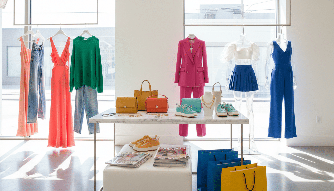
Yellow in Branding and Marketing
Yellow is full of energy and stands out. Brands use it to seem friendly, optimistic, and affordable. It’s great for appearing easy to reach, fun, or noticeable in busy places.
When to choose yellow for logos and identity
Pick a yellow logo to grab people’s attention and feel welcoming. It’s perfect for food, kids’ items, travel, and budget stores. Luxury brands should use muted gold or pair yellow with dark colors for a serious vibe.
Case studies: successful brands using yellow
McDonald’s has a bright yellow arch for more visibility. IKEA combines yellow with blue for a dependable, friendly image. National Geographic’s yellow frame is instantly recognizable. Best Buy’s yellow tags draw your eye. These brands show yellow helps memory, breaks through clutter, and sets expectations.
Accessibility and readability considerations
Yellow text must be easy to read against its background. WCAG suggests enough contrast for good visibility. Steer clear of light yellow on white. Use dark overlays or strong outlines to make text stand out.
Try tools like WebAIM Contrast Checker to check color combos. Add icons or labels to keep info understandable for everyone.
| Brand | Yellow Use | What it Achieves | Accessibility Tip |
|---|---|---|---|
| McDonald’s | Golden arches in signage and packaging | High visibility, appetite signaling, strong memorability | Use dark backgrounds for menus to keep text legible |
| IKEA | Logo pairing of yellow and blue | Friendly, trustworthy retail presence; stands out in catalogs | Ensure catalog text meets contrast ratio for print and web |
| National Geographic | Yellow border as consistent brand marker | Instant recognition across platforms; editorial authority | Maintain border contrast on varied imagery to remain distinct |
| Best Buy | Yellow sale tags and CTAs | Draws attention to offers; drives conversion through urgency | Use bold type and dark outlines on sale tags for readable copy |
Yellow in Interior Design
Yellow adds energy and warmth to your home when thoughtfully used. The choice of room, furniture, and types of light can change how a color looks. Even small choices about shade and where to use it matter a lot.
Choosing the right shade for different rooms
For kitchens and offices, choose bright tones like lemon. These colors help increase focus and appetite. In bedrooms, soft yellows create a calming atmosphere. Dining rooms and libraries look great with darker yellows that add depth.
In tiny rooms, lighter yellows make the space feel bigger. Always test paint on walls to see how light affects the color before deciding.
Accent walls, upholstery, and décor tips
Start by adding yellow with small items like pillows or art. A yellow wall can be the focus of a room, especially with neutral furniture.
Yellow works well with natural materials and metals like brass. Choose tough, muted yellow fabrics for busy spots to keep them looking good.
Balancing natural and artificial lighting with yellow
Light affects how yellow looks. In north-facing rooms, yellow appears cooler. But, in south-facing rooms, it looks warmer with the sunlight.
Artificial light also changes yellow’s appearance. Warm lights make yellows richer, whereas cool lights can make them seem greenish. Always check paint in different lights.
| Room | Recommended Yellow | Why it Works | Lighting Note |
|---|---|---|---|
| Kitchen | Lemon, sunflower | Boosts energy and appetite; pairs with white or stainless steel | South light amplifies warmth; use warm LEDs for consistent tone |
| Home office | Bright butter, clear yellow | Enhances focus and optimism without distraction | Balance with task lighting; avoid harsh cool fluorescents |
| Bedroom / Nursery | Soft buttery, pastel yellow | Calming, creates restful atmosphere | Natural light softens tone; warm bulbs for evenings |
| Dining room / Library | Mustard, amber | Adds sophistication and cozy depth | Warm ambient lighting or dimmable fixtures enhance richness |
| Small spaces | Pale lemon, cream yellow | Reflects light to make rooms feel larger | Even daylight and soft LEDs prevent glare |
Yellow in Graphic and Web Design
Yellow catches the eye online, especially if used smartly. In yellow-themed web design, it’s key to be subtle to avoid tiring the eyes. Warm neutral colors and even spacing help yellow accents pop, without flooding the reader’s view.
UI/UX best practices for using yellow online
Use yellow mainly for important clicks or small interactions. A lone bright spot draws attention better than a fully yellow background. Combine these accents with off-white or gray to maintain a peaceful user journey.
Make sure buttons and links are big enough to easily tap on mobile devices. It’s also important to check that yellow elements change clearly when clicked. This helps lower mistake rates and increases user happiness.
Contrast, legibility, and call-to-action design
Create standout CTAs with yellow buttons that have easily read text. For lighter yellows, pick dark text, and for darker yellows, choose light text. Always aim for high contrast according to WCAG standards.
To improve reading, add thin lines, slight shadows, or borders around yellow components. Also, make sure there are special focus styles and secondary options. This helps everyone, including those with vision challenges, navigate without trouble.
Testing yellow across devices and browsers
Colors change on different screens like phones, computers, and tablets. Testing across devices confirms the yellow looks right everywhere. Check color accuracy by comparing how it appears in Chrome, Safari, and Firefox.
Tools like developer panels in browsers and BrowserStack can show how designs might look to others. It’s wise to give a high-contrast setting option, and never use only yellow for important alerts or statuses.
Here’s a quick guide: Make sure yellow elements meet WCAG contrast guidelines, verify button behaviors, test colors on various devices, and tweak designs based on what users say. Following these steps helps make yellow both effective and appealing in designs.
Textiles and Fashion: Wearing Yellow Confidently
Yellow stands out in closets and on fashion runways. This part will guide you in picking shades that suit your skin. It also shows how to combine clothes smoothly. Learn easy tests to find your perfect yellow under sunlight at home.

Selecting shades that flatter skin tones
Golden, mustard, and warm yellows are great for warm skin tones. Lemon and chartreuse yellows suit cool skin tones. Yellows with blue undertones also work well here. People with neutral skin tones can wear many kinds of yellow clothes.
To see if a yellow is right for you, hold a piece of it by your face in daylight. If your face looks brighter, the yellow is a good match. If not, try another yellow or wear a white shirt under it for balance.
Mixing patterns and textures with yellow garments
You can match yellow clothes with stripes, florals, or checks to make your look interesting. Keeping one accent color common in all patterns helps everything look good together. Adding textures like knits, silk, and linen makes yellow feel intentional, not too loud.
Denim, navy, and white pieces can calm down bright yellow clothes. For a classy look, wear a mustard sweater with a navy blazer. Or, pair a bright lemon dress with a denim jacket.
Seasonal trends and timeless yellow pieces
Fashion runways bring yellow trends back every year, from spring’s bright colors to autumn’s mustard shades. Buying trend-led items like a high-saturation lemon piece can update your closet for the season.
It’s smart to invest in timeless yellow items like a camel coat, a mustard sweater, or a warm-yellow scarf. These pieces will last many seasons and styles. They keep your looks up to date without sacrificing timelessness.
| Style Goal | Suggested Yellow | Pairing Tips |
|---|---|---|
| Everyday neutral | Mustard | Denim, white tee, brown leather accessories |
| Bright statement | Lemon | Navy blazer, simple jewelry, neutral shoes |
| Office-friendly | Golden-camel | Charcoal trousers, silk blouse, structured coat |
| Textured casual | Warm ochre | Knit layers, linen trousers, patterned scarf |
| Mixing prints | Chartreuse accent | One print anchor, matching accent color across pieces |
Painting and Illustration: Mixing Yellow Pigments
Choosing the right yellow means knowing the pigments. Cadmium Yellow offers warmth and covers well. Yellow Ochre has earthy tones and lasts a long time in the light. Hansa Yellow shines bright and clear. Lemon Yellow looks fresh and cool. Match the pigment to your painting medium. Oils go well with cadmiums, acrylics are good with Hansa, and watercolors look great with either lemon or ochre.
To change the color warmth, mix in a little red or orange. This makes it golden. Add a bit of blue or green to get muted olive or moss shades. Use white carefully to brighten without making it dull. These tips keep your yellow mixes vibrant and clear.
Layering different yellows can add depth. Start with a warm base, then add light, cool yellow on top. Dry-brushing with opaque lemon yellow can highlight areas. For glowing effects, paint a dark base then use transparent yellow on top.
Using lasting pigments is key for keeping colors true. Choose pigments rated ASTM I or II. Brands like Winsor & Newton, Gamblin, and Golden are good choices. Use acid-free materials to prevent the underlying paint from turning yellow. These steps will help your artwork last.
To protect your painting, use a UV-filtering varnish once it’s dry. If you frame it, use special museum glass that blocks UV rays. Keep unframed artwork flat in a cool, dark place. Use acid-free paper in between to keep the colors stable.
A table below lists common yellow pigments. It helps you understand their qualities and when to use them.
| Pigment | Color Bias | Opacity | Lightfastness | Best Uses |
|---|---|---|---|---|
| Cadmium Yellow | Warm, slightly orange | Opaque | ASTM I (excellent) | Oils, acrylics, strong warm mixes |
| Yellow Ochre | Warm, brownish | Semi-opaque | ASTM I (excellent) | Underpainting, earthy palettes, watercolor washes |
| Hansa Yellow | Neutral to cool | Transparent | ASTM II (good) | Acrylics, glazing, bright mixes |
| Lemon Yellow | Cool, green-leaning | Transparent to semi-transparent | ASTM II (good) | Watercolor highlights, cool luminosity, illustration yellow accents |
Sustainable and Cultural Considerations of Yellow
Designers and creators have to think about their impact on people and the planet when they use yellow. They need to be mindful of how their choices in pigments and dyes can affect the environment and cultural meanings. The materials they choose can influence a color’s perception and how communities react to it.
Eco-friendly sources
Time-honored yellow hues come from natural sources like turmeric, weld, saffron, and pomegranate rind. Brands like Earthues and Dharma Trading Company are mixing natural extracts with safer mordants. This helps lower the pollution in our waters. Also, new synthetic options are being made that are safer for the planet and meet tough safety standards.
Cultural meanings and sensitivity
The meaning of yellow changes depending on where you are in the world. In the West, it’s seen as cheerful yet also a warning. But in China, it has royal meanings, and in India, it’s part of celebrations and religious rites. Yellow had a divine role in ancient Egypt. Designers need to know how different people see yellow to avoid sending the wrong message, especially in worldwide campaigns.
Ethical sourcing and certifications
Choosing ethical pigments means knowing about the supplier’s practices regarding heavy metals and labor. Textile certifications like OEKO-TEX and GOTS show that products are made safely and workers are protected. Brands should also check how suppliers handle waste and recycling. Having clear records of where materials come from makes a brand’s sustainability claims more trustworthy.
| Aspect | Traditional Options | Modern Sustainable Choices | Certifications and Checks |
|---|---|---|---|
| Source | Turmeric, weld, saffron, pomegranate rind | Low-toxicity synthetic pigments, plant-extract blends | OEKO-TEX, GOTS, supplier lab reports |
| Environmental Impact | Generally biodegradable, varies by mordant | Reduced heavy metals, optimized wastewater systems | Third-party audits, effluent testing |
| Cultural Context | Strong local traditions and ceremonies | Adapted palettes mindful of global audiences | Consultation with cultural experts, user testing |
| Supply Chain Risks | Seasonal variability, smallholder sourcing | Scaled production with transparency | Traceability, labor practice verification |
| Design Use | Authentic craft, heritage textiles | Commercial fashion, sustainable textiles yellow | Label claims backed by certificates |
To make ethical choices, try out both old and new pigments, and look at lab results for toxins. Matching your artistic goals with clear records of where materials come from supports ethical sourcing. It also boosts trust when yellow is used in designs meant for the public.
Practical Tips for Choosing and Testing Yellow
Choosing the right yellow involves both hands-on testing and digital planning. Begin with small tests, make sure the lighting is consistent, and write down all codes and suppliers. This method helps avoid surprises when the color goes from screen to real life.
How to sample paint and fabric swatches effectively
Buy large sample pots and paint on panels using the primer and finish you’ll actually use. Check the panels in morning, noon, and night light to see color changes. For fabrics, get big swatches and place them near walls and your skin to test shine and size.
When testing yellow paint, mark each panel with its brand, formula, and when you tested it. Take photos with a color-true camera and compare them to the actual swatches to spot any differences.
Using digital mood boards and physical mockups
Create a yellow mood board using tools like Adobe XD, Figma, or Canva. Connect each digital color with a real-world Pantone or material code. This helps keep colors consistent during production.
Make real-life mockups for important items like brochures or furniture. A digital board gives you a direction, but you need to touch and see things to check texture, shine, and the effect of light.
Checklist for finalizing yellow selections
- Make sure all final swatches have their Pantone, Hex, and CMYK values confirmed.
- Do WCAG tests for text and background color contrasts.
- Look at samples in different lighting: natural, warm, and cool.
- Check if suppliers have what you need and ask for proofs.
- Test how well fabrics hold up and get cleaning instructions before big orders.
- Write down all final color codes, supplier info, and notes for making more later.
If you need things to be just right, test paint and fabric again whenever you change the formula. Keep your color checklist handy to speed up approvals and keep everyone on the same page.
Conclusion
We explored the emotional impact of yellow, its various shades, and its role in color theory. We looked at how to pair it, and its use in branding, interiors, web, fashion, and painting. We also considered sustainability and cultural meanings. Yellow can signal happiness, warmth, or sophistication based on its shade, intensity, and where it’s used.
When picking yellow, think about the mood you want and what the color needs to do. Test paint and fabric in natural light to see true colors. Check digital colors and make sure your choice is easy to read for everyone. Use tips like making sure it looks good on all devices. Combine vivid yellows with calm neutrals or cool blues to keep things clear.
Start by creating a mood board and order physical samples from trusted brands like Sherwin-Williams or Benjamin Moore. Look for fabrics that are certified by GOTS or OEKO-TEX for quality and safety. Keep trying out ideas, keep track of what you do, and share with others to get better at using yellow with purpose.
FAQ
What is the aim of “Exploring the Vibrant Shades of Yellow in Design”?
How do you define “shades of yellow” and what scope does the article cover?
Who is the target audience and what will they gain?
What psychological associations does yellow carry?
How does yellow influence mood and perception?
How should designers use yellow strategically in branding and interiors?
What are common named shades of yellow and typical uses?
How do hue, saturation, and brightness change the feel of a yellow?
Which digital and print color codes should I reference for yellow?
Where does yellow sit on the color wheel and what harmonies work well?
What is the difference between warm and cool yellows?
How do you pair yellow with complementary colors like purples and blues?
What neutral pairings work best with yellow?
How do you create harmony with analogous yellow palettes?
When is yellow a good choice for logos and brand identity?
Can you give examples of brands that use yellow successfully?
What accessibility and readability concerns come with yellow?
How should I choose yellow shades for different rooms in a home?
What are smart ways to use yellow as an accent in interiors?
How does lighting affect yellow in interiors?
What are UI/UX best practices for using yellow online?
How do I design legible CTAs and buttons using yellow?
How can I test yellow across devices and browsers?
How do I choose yellow garments that flatter skin tones?
How should yellow be mixed and layered in painting and illustration?
What materials and pigments are best for long-term color integrity?
Are there eco-friendly yellow dyes and pigments available?
How do cultural meanings of yellow vary around the world?
What ethical sourcing practices should I look for in pigments and textiles?
How should I sample paint and fabric swatches effectively?
How can I combine digital mood boards with physical mockups?
What should a final checklist include before locking in a yellow choice?
Content created with the help of Artificial Intelligence.